Quality Assurance Dashboards vs. Reports for QA: Key Differences
Picture this: you, as a QA professional, strive for real-time insights to keep your finger on the pulse of ongoing testing activities. Dashboards offer immediate, at-a-glance insights into ongoing testing progress. On the other hand, reports provide you with in-depth analysis, offering a comprehensive overview and detailed breakdown of the testing landscape. But, which one should you rely on in your day-to-day activities? Let's explore both in detail with aqua's decade-long expertise to understand where and how each can empower your testing endeavours.
A QA metrics dashboard gives you a live read on what is happening right now: pass rates, open defects, test execution progress. A report tells you what happened and why.
Neither format replaces the other. Dashboards are for daily monitoring; reports are for review cycles, audits, and stakeholder sign-off.
A software quality dashboard works best when it is focused. Too many widgets and it becomes noise. Stick to the metrics your team actually acts on.
Reports carry context that dashboards cannot: narrative, root cause analysis, period-over-period trends, and documentation for compliance.
Choosing between the two usually comes down to audience and urgency. When someone needs an answer in 30 seconds, send them to the dashboard. When they need to understand a release, send them the report.
A test management system like aqua lets you run both from one place, so you are not stitching together data from separate tools.
What is a QA Dashboard?
A QA dashboard is an interactive visualis interface, designed to display the most crucial testing metrics at a glance. A QA dashboard is more than just a collection of figures. It’s a dynamic interface that showcases real-time data, letting you keep an eye on your testing results as they happen. Key features of such dashboards include:
Real-time Data Monitoring: Data in dashboards is continually updated, providing instant insights into the testing process.
Customisable Views: Teams can tailor the dashboard to display specific KPIs, metrics, and other vital data points relevant to their project or organisation.
Interactive Elements: With features like drill-down options, teams can delve deeper into specific metrics for a more detailed analysis.
Visual Representations: Graphs, charts, and heatmaps make data interpretation intuitive and straightforward, catering to technical and non-technical stakeholders.
Now that you know this, it makes sense to ask: which dashboards are the most popular and efficient in QA? Based on recent industry data, below are the three most commonly used dashboards among QA experts:
Bug Density Tracking Dashboards: Providing real-time insights into the number and severity of bugs within a given software iteration.
Test Execution Rate Monitors: Giving teams an immediate overview of how many test cases have been executed, passed, and failed.
Software Performance Metric Analysers: Highlighting the software’s performance, speed, and reliability in various scenarios.
However, while these dashboards cater to most QA needs, you often need a more tailored approach. Adding dashboards like defect age analysis, test coverage charts, or sprint burn-down metrics to your workspace might prove beneficial.
"Dashboards are a vehicle that assists us in moving from data to insight."
Stephen Few, Data visualisation expert
What is a QA Report?
A QA report is a structured document that captures what happened during a testing period, why it happened, and what should follow. Where a dashboard shows you the present state of your software quality dashboard, a report explains the story behind it.
While dashboards provide real-time insights, QA reports present data comprehensively and structured. A QA report is essentially a document, sometimes static, detailing the results, outcomes, and recommendations post-testing. Reports play a crucial and pivotal role in decision-making in many traditional software development lifecycles, such as the Waterfall model. They are structured, methodical, and thorough in their approach. Key features include:
Detailed Analysis: Comprehensive information on various testing metrics, offering insights into every nuance of the testing process.
Periodic Updates: Unlike the real-time nature of dashboards, reports are typically generated daily, weekly, or after specific testing milestones.
Narrative Insights: Reports are crafted to provide context, weaving data into a storyline that clearly explains the testing results.
Tabular & Graphical Data: Tables and basic graphs break down complex data sets, making the report reader-friendly and interpretable.
Having covered the key aspects of reports, we can now delve into the various types of reports and their unique functionalities. Like dashboards, there are also different types of reports, including the following three:
Defect Trend Analysis Reports offer insights into the trends of defects you’ve identified over time. They detail issues’ types, frequency, and status changes throughout different software iterations, helping you track and understand the evolution of problems.
Test Coverage Summary Reports give you a comprehensive overview of the test coverage you’ve achieved. They detail the percentage of requirements or functionalities tested and their status—covered, partially covered, or not covered—giving you a clear picture of what’s been tested and what needs attention.
Release Quality Assessment Reports evaluate the overall quality of your software release. By aggregating data on test execution results, defect density, and other quality metrics, they provide you with a snapshot of your software’s readiness for deployment, helping you make informed decisions about releasing your product.
These QA reports are instrumental in reviewing test planning efficacy, understanding the root cause analysis of defects, evaluating team performance, and offering actionable recommendations.
Considering the distinctions between reports and dashboards, you might feel inclined to pick one over the other. However, the Test Management System (TMS) brings everything together, making QA dashboards and reports work hand in hand. This combo doesn’t just make things easier to see; it helps you plan tests better, do them more systematically, and understand what needs fixing. With a TMS, you see the bigger picture of the QA process, so you can make smarter decisions, keep improving, and aim for higher quality standards.
And what if there’s a solution that provides the best of both worlds? aqua cloud is a comprehensive platform that seamlessly integrates extended reports functionality and dynamic dashboards. With aqua, you don’t have to compromise; you gain access to diverse metrics, KPIs, and export formats, empowering your QA process with unparalleled transparency and insights. Experience the mix of robust reporting and interactive visualisation—embrace aqua for a holistic QA experience.
Achieve 100% transparent and insightful transparency in QA with aqua Dashboards module
A QA report is a structured document that captures what happened during a testing period, why it happened, and what should follow. Where a dashboard shows you the present state of your software quality dashboard, a report explains the story behind it.
At first glance, you might think dashboards and reports are interchangeable in the QA ecosystem. However, the differences become apparent when you look into the functionalities and purposes they serve. Both are vital in their own right and can be seen as complementary rather than competing. Below, you see the comparison of their distinctive attributes, clarifying when and why you should choose one over the other.
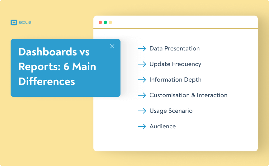
1. Data Presentation
Dashboard: Offers real-time, dynamic visualisations with interactivity.
Report: Provides a structured, periodic snapshot of testing results, often in a narrative form.
2. Update Frequency
Dashboard: Continually refreshed to provide instant data insights.
Report: Generated at predetermined intervals, capturing data from a specific timeframe.
3. Depth of Information
Dashboard: Gives a high-level view, allowing for immediate insights.
Report: Goes in-depth, enabling a thorough analysis with comprehensive data sets.
4. Customisation & Interaction
Dashboard: Highly customisable with interactive elements, enabling users to engage with data dynamically.
Report: More static in nature, crafted for detailed study rather than real-time manipulation.
5. Usage Scenario
Dashboard: Ideal for regular monitoring and quick decision-making.
Report: Best suited for in-depth reviews, strategy sessions, and stakeholder meetings.
6. Audience
Dashboard: Suitable for a broader audience, from QA teams to top-level management.
Report: Often tailored for specific stakeholders, such as project managers, QA leads, and executive teams.
While understanding the nature and features of dashboards and reports is crucial, it’s equally important to comprehend how they fit into your daily operations. Let’s break down their practical applications:
Dashboard
When to Use: Utilise dashboards when you require real-time insights, such as during ongoing testing cycles, daily stand-ups, or when you need to monitor the progress of QA tasks frequently. They are especially handy for teams practising Agile methodologies where quick decision-making is paramount.
Building Your Workflow: Begin your day or week by quickly glancing at the dashboard to get a pulse on the ongoing projects, bug statuses, or test executions. This gives you an instant snapshot, helping you prioritise tasks or identify immediate concerns.
Report
When to Use: Turn to reports when you’re preparing for weekly reviews, stakeholder meetings, or when you’re wrapping up a testing phase. They are essential for teams that need structured feedback, comprehensive analysis, and detailed data to make informed decisions.
Building Your Workflow: Dedicate specific intervals (e.g., end of the week or post-testing phase) to delve deep into reports. Study them to gauge the testing process’s effectiveness, identify improvement areas, and strategise the next steps.
Remember, choosing between a dashboard and a report isn’t about picking the superior tool; it’s about recognising which tool aligns best with your immediate needs and technical objectives. Both have their place in the QA landscape, and their optimal utilisation can substantially elevate and most likely change your QA processes.
Let’s put you to the test. Can you identify whether you need a dashboard or a report in 8 different scenarios?
Dashboard vs Report Quiz
📊Dashboard or Report? The Decision Challenge
▼
Dashboards vs Reports: Choosing the wrong one wastes time and confuses stakeholders.
Your Challenge: Face 8 real QA scenarios and decide which tool fits best.
Scenario 1 of 80/8 Correct
How to Choose Between a Dashboard and a Report
The question to ask is not which format is better. It is who needs this information, and how fast do they need to act on it.
If someone needs to check whether the overnight test run passed before the morning standup, a qa metrics dashboard is the right call. The answer is visible in seconds. If someone needs to prepare a release sign-off document, brief a stakeholder on quality trends, or run a retrospective on a bug-heavy sprint, a report gives them the depth they need.
Audience matters too. Developers and QA engineers tend to live inside dashboards during active test cycles. Managers, product owners, and compliance teams typically engage through reports. A well-structured software quality dashboard might be on a screen in your QA team’s shared workspace all day, while a weekly report goes out as a PDF to people who were never going to log into your test management tool.
A practical way to decide: if the metric needs to trigger an action today, put it on a dashboard. If the metric needs to explain a pattern over time, put it in a report. Most QA teams need both running in parallel, not one or the other.
Similarities between dashboards and reports
It’s not only about differences: dashboards and reports also share similar functions and purposes, particularly in software testing and QA management. Here are some of them:
Overview and Insights: Both dashboards and reports provide an overview of key metrics and insights relevant to software testing and QA management. A software testing dashboard and a QA management dashboard both offer at-a-glance visibility into various aspects of the testing process, such as test execution status, defect metrics, and test coverage.
Visual Representation: Dashboards and reports often utilise visual representations, such as charts, graphs, and tables, to convey information effectively. A software testing dashboard may display metrics like test pass rates, bug trends, and test case distribution through visual elements, similar to how reports present data in visual formats for easier comprehension.
Customisation and Interactivity: Dashboards and reports often offer customisation options to tailor the displayed information to specific needs and preferences. Users can typically interact with dashboards and reports to drill down into details or filter information based on various criteria, enhancing usability and flexibility.
While dashboards and reporting tools differ in their presentation styles and interactivity, they share commonalities in their ability to provide insights, visualise data, offer real-time monitoring, and support customisation in software testing and QA management.
Common Mistakes When Using QA Dashboards and Reports
The tools are only as useful as how they are set up and maintained. A few patterns consistently undermine them.
Overloading the dashboard is the most common one. When a qa metrics dashboard has 20 widgets covering every conceivable metric, it stops being a monitoring tool and becomes a data dump. Nobody scans it. The fix is to limit it to the five or six numbers that directly drive decisions in the current sprint or release cycle.
Treating reports as a formality is the opposite problem. Reports that get generated on schedule but never read are a sign that they are covering the wrong things, written for nobody in particular, or formatted in a way that makes them hard to digest. A good report answers specific questions: are we ready to release? Where did quality slip this cycle? What changed since last sprint?
Keeping dashboards and reports in separate tools is another trap. When your software quality dashboard lives in one place and your reports are assembled manually from exported spreadsheets, the data is already stale by the time anyone reads it. Connecting both to the same data source, as aqua does through its integrated reporting and dashboard modules, removes that lag entirely.
Finally, forgetting to update the metrics. A dashboard built around the priorities of a project six months ago may be tracking things that no longer matter. Reviewing what is on your dashboard at the start of each quarter takes about 20 minutes and keeps it from becoming background noise.
I’ve used a low-tech testing dashboard before and found it met my needs quite nicely.
nicola849279
Posted in Software Testing Reddit thread, 2 years ago
Conclusion
When diving into the realms of QA, the significance of dashboards vs reporting is undeniable. Each serves unique purposes in the QA process, from offering quick, real-time insights to presenting a detailed and structured overview of testing results. However, the key isn’t merely to understand these tools in isolation but to find an optimal solution that seamlessly integrates them.
If you’re seeking an efficient way to harness the power of dashboards and reports, aqua is designed precisely with your needs in mind. With aqua, you’re not just getting a tool but adopting a comprehensive solution. Our platform offers pre-configured reports for immediate use, ensuring you don’t miss out on crucial data points. Yet, if you desire a personalised touch, aqua’s customisable dashboards allow you to craft an interface tailored to your project or organisation’s specific needs. Its intuitive design makes even the most complex dashboard setups a breeze.
Revolutionise your reporting game with 100% transparent dashboards
A QA report is a document summarising the quality assurance activities, findings, and outcomes within a specific period. It typically includes information about test execution, defect metrics, test coverage, and any other relevant QA-related data, providing stakeholders with insights into the quality of the software being tested.
What is a dashboard in testing?
A dashboard in testing is a visual representation of key metrics and indicators related to the testing process. It provides stakeholders with a concise and easily accessible overview of test progress, test coverage, defect status, and other relevant information, facilitating quick decision-making and monitoring of testing activities.
What are the differences between dashboards and reports?
Dashboards provide real-time visual summaries of key metrics and indicators, offering at-a-glance insights into current performance. They are highly interactive and customisable, allowing users to drill down into details. On the other hand, reports offer detailed, structured analyses of historical data and trends. They typically provide comprehensive, static information, suitable for in-depth analysis and documentation purposes.
What are the similarities between dashboards and reports?
Both dashboards and reports offer insights into data, allowing stakeholders to make informed decisions. They utilise visual elements such as charts and graphs to present information effectively. Additionally, they can be customised to meet specific needs and provide visibility into key metrics related to a particular aspect of the business or project.
What is a quality assurance dashboard?
A quality assurance dashboard is a visualised data that helps you track and monitor key metrics related to quality management. It is real-time tool reflecting on things like defect severity distribution, testing success rates, bug resolution times, and even end-user reported metrics that reflect customer satisfaction. The goal is to help you stay on top of project progress and quality control.
How to create a QA dashboard?
To create a QA dashboard, start by defining the key metrics that matter most to your project, like data quality, defect severity distribution, and overall quality control dashboard performance. Then, choose a tool that integrates well with your project management system, and set up visualisations that make these metrics easy to read and act on.
What is the KPI for quality assurance?
A KPI for quality assurance is a measurable value that shows how well you’re achieving your quality goals. Common KPIs include defect detection rate, defect severity distribution, and product quality metrics that directly impact project quality control and customer service performance.
What are the 4 types of quality assurance?
The 4 main types of quality assurance are:
Process Assurance – Ensuring effective processes in the project.
Product Assurance – Focusing on the quality of the product itself.
Project Quality Assurance – Overseeing project management and making sure quality standards are met.
Customer Satisfaction Assurance – Monitoring how well the product meets customer expectations, driving customer service performance.
How do you decide which QA metrics belong on a dashboard versus in a report?
The deciding factor is how quickly the metric needs to drive action. Pass/fail rates, open critical bugs, and test execution progress belong on a qa metrics dashboard because someone may need to act on them the same day. Defect trend analysis, root cause summaries, test coverage over a release cycle, and team performance over time belong in a report because they require context and are reviewed periodically rather than monitored continuously. If a metric would only make sense alongside an explanation, it goes in a report. If it needs to be glanceable, it goes on the dashboard.
Can a QA dashboard replace manual status meetings for testing teams?
For day-to-day progress checks, a well-built software quality dashboard reduces the need for meetings significantly. When the whole team can see pass rates, open defects, and execution status without asking someone to pull numbers together, a lot of the routine standup content becomes redundant. That said, dashboards do not replace conversations about decisions, priorities, or blockers that require judgment rather than data. The teams that get the most out of dashboards tend to use them to shorten meetings rather than eliminate them, spending less time on status and more time on what to do about it.
Home » Best practices » Quality Assurance Dashboards vs. Reports for QA: Key Differences
Do you love testing as we do?
Join our community of enthusiastic experts! Get new posts from the aqua blog directly in your inbox. QA trends, community discussion overviews, insightful tips — you’ll love it!
We're committed to your privacy. Aqua uses the information you provide to us to contact you about our relevant content, products, and services. You may unsubscribe from these communications at any time. For more information, check out our Privacy policy.
X
🤖 Exciting new updates to aqua AI Assistant are now available! 🎉


 Bankingaqua ALM helps banks increase testing productivity by over 50%


