Are you lost in the labyrinth of testing your website on different browsers, feeling overwhelmed by all the updates, changes, and fixes all the time? We understand it: the struggle is real. Ensuring your website works seamlessly across different browsers is daunting, with each browser presenting unique challenges. That is where cross-browser compatibility testing comes to your help. But how complicated is this testing method? In this guide, we give you the weapon you will need to rock cross-browser compatibility tests.
Web browser compatibility testing checks that a website renders and functions the same way across Chrome, Firefox, Safari, Edge, and their various versions, not just on the browser your team happens to develop in.
Browsers render the same HTML, CSS, and JavaScript differently because each uses its own rendering engine and JavaScript engine, not because your code is necessarily wrong.
A solid browser compatibility testing checklist covers visual layout, interactive elements, performance, and feature support, both before and during testing, not just at the end.
Most cross-browser problems fall into four categories: layout breaks, JavaScript errors, font rendering inconsistencies, and media playback failures.
Preventing issues at the code level, through standards compliance, feature detection, and progressive enhancement, costs far less than finding and fixing them after the fact.
Definition of cross-browser compatibility testing
Cross-browser compatibility testing is the process of checking whether a website or web application works correctly and fits the requirements across different web browsers and their versions. This means making sure that when users access your website using Google Chrome, Mozilla Firefox, Safari, Microsoft Edge or any other browser (and its different builds/versions), they have the same seamless experience.
You often conduct this testing to ensure the website functions properly and provides a consistent user experience regardless of the browser used. Or it could be the case where you identify specific behaviour in a version of some browser and carry out the testing on that specific version. It involves testing various aspects such as layout, functionality, performance, and responsiveness to ensure the website behaves as expected.
So cross-browser compatibility testing definition in a nutshell: ensure your website doesn’t have unexpected behaviors on different browsers and their versions.
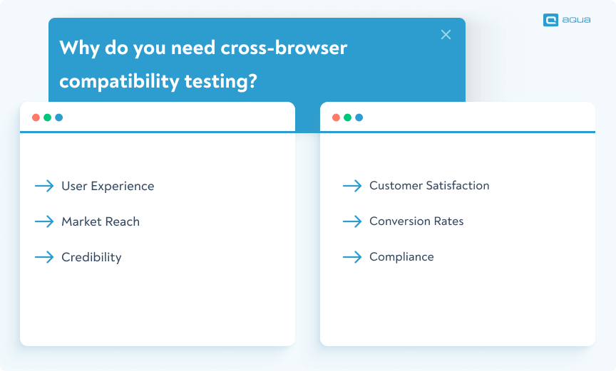
Why do you need cross-browser compatibility testing?
You need web browser compatibility testing because without it, you have no way of knowing whether the experience you designed is the experience your users actually get. A layout that looks perfect in your development browser can be broken, slow, or completely non-functional in another.
Here are some key purposes of cross-browser compatibility testing (and also the reasons why you should not ignore it):
User Experience: Different browsers may interpret website code differently, leading to variations in layout, functionality, and performance. Cross-browser compatibility testing ensures that users have a consistent and seamless experience regardless of the browser. This includes consistent design elements, navigation, and functionality across all browsers.
Market Reach: Users have their preferences when it comes to web browsers. By ensuring compatibility across different browsers such as Google Chrome, Mozilla Firefox, Safari, and Microsoft Edge, your website can reach a broader audience. This is essential for maximising the website’s potential reach and attracting users from diverse demographics.
Credibility: Inconsistencies or errors in websites on different browsers can harm the credibility and professionalism of the website. Cross-browser compatibility testing helps maintain a polished appearance and ensures that the website functions correctly, reinforcing users’ trust in the brand or organisation behind the website.
Customer Satisfaction: Users expect websites to work seamlessly, regardless of the browser they use. Issues like layout distortion, broken functionality, or slow performance will frustrate users and lead to a negative perception of your website. We assume you don’t want this, and cross-browser compatibility testing helps you identify and resolve such issues.
Conversion Rates: A website that works well across all browsers is more likely to facilitate user interactions such as completing purchases, filling out forms, or signing up for services. By eliminating barriers to user engagement caused by browser compatibility issues, you can improve conversion rates and drive business goals.
Compliance: Cross-browser compatibility testing ensures compliance with accessibility standards and legal requirements related to web accessibility. Many jurisdictions have regulations to ensure that websites are accessible to users with disabilities, and cross-browser compatibility testing helps identify and address accessibility barriers across different browsers.
Knowing the importance of cross-browser compatibility testing is important, but knowing how to do it perfectly is even more crucial. How will you do this?
This is where we bring you the ultimate solution that will redefine your approach.
Which browsers to choose for cross-browser testing?
You might wonder: with so many browsers out there, which ones should you prioritise in your testing process? Choosing the right browsers for cross-browser testing is essential to ensure your website performs well for users and avoids cross-browser compatibility issues. But how do you decide?
Here are some factors to consider:
Market Share: Focus on the most widely used browsers, such as Google Chrome, Mozilla Firefox, Safari, and Microsoft Edge. These cover the majority of global users and are crucial for ensuring your website’s browser compatibility.
Target Audience: Know your audience and their preferences. Are they more likely to use specific browsers or devices? Testing on the platforms they use the most ensures that your cross-browser testing covers the relevant users.
Browser Versions: It’s not just about testing on the latest versions. Many users don’t always update immediately, so consider testing on older versions to catch potential cross-browser compatibility issues.
Device Types: Ensure that you test across both desktop and mobile versions of browsers, as the browsing experience can differ significantly between devices. Proper browser testing across device types helps provide a consistent experience.
Focus on the most relevant browsers for your audience and market. Only then can you ensure more comprehensive test coverage while keeping the process efficient and effective.
How to test cross-browser compatibility
To ensure effective cross-browser compatibility testing, follow these best practices:
Establish a testing matrix that outlines the most critical browsers and devices based on your user base.
Focus on responsive design to verify that your site adapts well to various screen sizes and resolutions.
Automate repetitive tests using cross-browser testing tools to efficiently identify compatibility issues.
Manually inspect visual elements to spot subtle differences automation may miss.
Document inconsistencies thoroughly to help developers quickly address browser-specific issues.
By following these practices, you can ensure smoother functionality across different browsers and platforms.
How do frontend developers ensure cross-browser compatibility?
Testing, testing, testing.
deathpie
Posted in Frontend Reddit thread, 5 years ago
Why Browsers Render the Same Code Differently: Rendering & JavaScript Engines
Every browser is built around two separate engines that determine how your code actually displays: a rendering engine, which converts HTML and CSS into the visual page you see, and a JavaScript engine, which executes your scripts. Chrome and Edge both use the Blink rendering engine paired with V8 for JavaScript. Firefox uses Gecko paired with SpiderMonkey. Safari uses WebKit paired with JavaScriptCore. These are not implementation details you can ignore. They are the actual reason web browser compatibility testing exists as a discipline.
Each engine follows the same web standards on paper, but implements them with small, accumulated differences. A flexbox gap property might render correctly in Chrome but fail silently in an older Firefox build. A box-shadow value might render with subtly different blur radius depending on engine version. Form controls and native input widgets can look noticeably different between Blink and Gecko because each browser applies its own default styling before your CSS even loads.
This is also why two browsers can run the exact same JavaScript and produce different results. V8, SpiderMonkey, and JavaScriptCore each optimize execution differently, support newer ECMAScript features on different timelines, and handle certain edge cases (like specific Date parsing formats or certain Promise behaviors) inconsistently. A script that works flawlessly in Chrome’s V8 engine can throw an unexpected error in an older Safari build still running on an earlier JavaScriptCore version.
Understanding this distinction matters practically: layout and visual bugs almost always trace back to the rendering engine, while functional and logic bugs almost always trace back to the JavaScript engine. Knowing which one you are dealing with cuts your debugging time significantly, because it tells you immediately whether to inspect your CSS or your script.
How to Prevent Cross-Browser Issues at the Code Level
Fixing cross-browser issues after they appear in testing costs more time than preventing them at the code level in the first place. These five practices reduce how many issues your web browser compatibility testing actually finds, because fewer issues exist to find.
Write to web standards, not to one browser’s behavior. Validate your HTML and CSS against the W3C Markup Validation Service and a CSS validator before testing begins. Code that fails validation is the single most common source of inconsistent rendering across browsers, because invalid markup forces each browser to guess at your intent, and different browsers guess differently.
Use feature detection instead of browser sniffing. Checking “is this Chrome” or “is this Safari” to decide what code to run is fragile and breaks the moment a browser updates its user agent string or a new browser enters the market. Tools like Modernizr check whether a specific feature is actually supported, which is the question you actually care about.
Apply progressive enhancement as your default approach. Build a baseline experience that works everywhere using well-supported HTML and CSS, then layer on enhancements for browsers that support newer features. This means your site degrades gracefully on older browsers instead of breaking outright.
Normalize your CSS baseline. Every browser applies different default styles to elements like buttons, lists, and form inputs before your stylesheet loads. A normalize.css or reset stylesheet removes these inconsistent defaults so your own CSS is the only thing determining the final appearance.
Automate vendor prefixing instead of writing it by hand. Tools like Autoprefixer add the necessary -webkit-, -moz-, and other vendor prefixes to your CSS automatically based on your actual browser support targets, removing a manual step that is easy to forget and tedious to maintain as browser support requirements change over time.
How to perform cross-browser compatibility testing with aqua cloud
Performing cross-browser compatibility testing efficiently comes down to two things: speed and organization. aqua cloud handles both through two approaches, custom fields and value sets, that let you manage every browser variant of a test case without duplicating your entire test suite by hand.
Choose browsers based on four factors: market share among your actual users, your target audience’s known preferences, the spread of browser versions still in active use, and whether you need desktop, mobile, or both.
So how do you achieve these? Here is where aqua cloud comes into play. At the end of this section, we have also considered visual proof lovers and long text haters, so you can also skip to the video to avoid all textual explanations of the video.
As mentioned, cross-browser compatibility testing includes executing the same test case across various browsers to ensure consistent behaviour across all platforms.
One of the primary challenges of the process is not just the execution of tests across various browsers, but the organisation and management of it. Ensuring consistent behaviour of applications across different browsers is crucial, yet managing the tests can be complex and time-consuming. This involves planning which tests to run in which browsers, assigning these tests to various team members, tracking the execution results, viewing the results of previous runs, and rerunning test cycles as needed.
These tasks are often complicated as you need strong coordination and meticulous record-keeping. Without the right tools, you might resort to using traceability matrices, spreadsheets, or other workarounds that can quickly become cumbersome and inefficient.
Here is where aqua cloud comes into play. Our customer success manager, Robert Weingartz, suggests two approaches to streamline this process using aqua cloud. Let’s delve into each:
Option 1: Using custom fields
This approach involves creating a custom field in aqua called “browser” to designate the intended browser for each test case. You then duplicate the test case for each browser, adjusting the browser value accordingly.
aqua simplifies this method by offering placeholders that automatically substitute browser values during test execution, eliminating the need to modify test case descriptions manually.
This approach provides visual clarity, allowing you to view all test cases at a glance and easily filter or search as needed. It also offers flexibility in modifying test scenarios based on browser specifics. aqua’s support for custom fields and placeholders streamlines the process of cross-browser testing, making it more manageable and efficient for QA teams.
By using aqua’s intuitive interface and automation capabilities, you can execute test cases seamlessly across multiple browsers, ensuring comprehensive coverage and consistent performance.
Option 2: Using value sets for test executions
Alternatively, aqua offers the option to define browser values within value sets stored in a single test case. This eliminates the need to duplicate test cases for each browser, streamlining the testing process. While it might be visually complicated at first (you’ll get used to it with practice), this method is more compact and efficient, requiring only one test case to cover all browser variations.
aqua facilitates this approach by automatically repeating the test case for each pair of values in the value sets during test execution. You can also incorporate additional variables into your value set, which will be substituted into placeholders during the required step of test execution, thereby introducing the necessary variability.
Additionally, aqua enables you to generate a full set of test cases for each pair of value sets with a single click, saving time and effort in test case creation and management.
With aqua’s support for value sets and streamlined test case execution, you can execute cross-browser tests more efficiently and effectively. By using aqua’s advanced features and testing automation capabilities, you can ensure thorough coverage and reliable performance across all browsers.
So which approach to use? Let’s break them down to make it easier for you to decide: When executing test cases as part of a test scenario, both options provided by aqua cloud are convenient but have their differences.
Option 1: Executing test cases within a test scenario enables easy transfer of browser data to defect reports due to direct mapping of custom fields. For instance, if a bug is found while testing in Chrome, the “browser” field in the bug report will automatically inherit the value “Google Chrome.”
Option 2: aqua cloud allows the creation of a full set of test cases for each pair of value sets in just one click. This feature saves time by generating all test cases for each case, eliminating the need for manual copying, even when dealing with a large number of test cases.
As a result:
Option 1 excels in seamless data transfer, ensuring accurate defect reporting.
Option 2 shines in efficiency, particularly for generating multiple test cases with different value sets. Choose the option that aligns best with your specific testing needs and workflows.
And here is the full explanation of the process with all the necessary points you need:
Impressed by all these? This is just one of the hundreds of ways you can streamline your testing process with aqua cloud! Apart from seamless cross-browser compatibility testing, aqua also allows you to generate test cases from requirements in just a few seconds. As an ultimate solution for AI-powered agile testing, aqua’s integration with Capture (1-click bug-tracking tool) allows you to generate visual bug reports seamlessly, while its AI Copilot is your ultimate buddy in all your test management efforts. Ready to give your testing process the boost it needs?
Automate 200% of your testing efforts with aqua cloud
Understanding how different browsers interpret the same CSS code is one thing, seeing it in action is another. Before we dive further into troubleshooting, let’s put your skills to the test. Can you spot which browser is rendering which version of the same code just by looking at subtle visual differences?
Interactive Challenge: The CSS Interpretation Detective
▼
Test Your Cross-Browser Compatibility Skills!
Below is a simple CSS code snippet. The same exact code has been rendered in 4 different browsers, but each browser interprets it slightly differently. Your mission: carefully examine the subtle visual differences and match each rendering to the correct browser.
Hint: Look for gradient banding (visible stripes), color brightness differences, corner sharpness, text boldness, and letter spacing!
How to ensure cross-browser compatibility: The checklist
Before diving into cross-browser testing, it’s important to prepare and ensure all necessary elements are in place for an effective test.
Pre-testing Check:
Ensure your website follows web standards and best coding practices.
Validate HTML and CSS to minimise basic errors.
Identify key browsers based on browser compatibility and your target audience.
Now that you are ready to test, let’s look at the checklist you should follow during the testing process.
Testing Checklist:
Visual Layout: Test for consistent layouts across browsers.
Interactive Elements: Check forms, buttons, and navigation for responsiveness.
Performance: Measure loading times and performance across different browsers.
Feature Support: Ensure that essential features work properly in each browser.
By following these steps, you can address cross-browser compatibility issues effectively. But this is only the theoretical part. In the next sections, we bring you the practical part with the ultimate solution, aqua cloud.
Troubleshooting common cross-browser compatibility issues
Now it’s time to move on to cross-browser compatibility issues. They can significantly impact your website’s performance and user experience, but there is always a way around them. So troubleshooting these doesn’t have to be overwhelming. Here are some common issues you might encounter, along with clear explanations and specific solutions:
1. Layout Problems: Misaligned elements can disrupt the overall design of your site. This often happens because different browsers interpret CSS differently.
And here is the solution, step-by-step:
Utilise tools for layout: Use tools like BrowserStack or Sauce Labs to test the layout across multiple browsers and devices. This helps identify misalignments specific to certain environments.
Create detailed test cases: Develop test cases that focus on layout checks for different screen sizes. Document any discrepancies you find to provide clear feedback to the development team.
Use Responsive Design Testing Tools: Use tools like Responsinator or Google Chrome’s built-in responsive design mode to check how the layout behaves on various screen sizes and resolutions.
Visual Inspection: Perform manual checks for critical pages in different browsers. Pay close attention to alignment, spacing, and overall design consistency.
2. JavaScript Errors: The scripts may run smoothly in one browser but crash or behave unexpectedly in another. This can occur due to differences in how browsers interpret JavaScript code.
Here is what you should do to solve this issue quickly:
Use automated testing frameworks: Implement automated testing frameworks like Selenium or Cypress to execute your scripts across multiple browsers. Using TMS like aqua cloud which offers smooth automation integrations, you can catch errors earlier.
Cross-Browser Testing Tools: Again, solutions like BrowserStack or Sauce Labs will be useful to run your application in different browser environments. This way, you can identify JavaScript issues specific to certain browsers.
Error Logging: Integrate error logging tools such as Sentry or LogRocket to capture JavaScript errors and performance issues during testing. This will help you track and report bugs effectively.
3. Font Issues: Fonts can look different on various browsers, impacting the readability and aesthetic of your site. This inconsistency mainly happens due to how browsers render fonts.
Here is what you should do:
Conduct visual checks: Thoroughly check font rendering across multiple browsers to identify problems in appearance.
Develop a font checklist: Create a checklist that includes specific font styles, sizes, and weights to ensure all elements are rendered correctly.
Establish a baseline reference: Create a baseline visual reference for each browser to compare against during testing.
Carry out accessibility testing: Ensure readability by checking colour contrast and font legibility on different backgrounds.
Collect User Feedback: Collect insights from users about font-related issues you might miss during testing. This way you will ensure thoroughness.
4. Media Playback Problems: Videos and audio files do not play consistently across all browsers, often due to unsupported formats.
Here is how you should solve this quickly:
Verify Supported Formats: Check that the media files use widely supported formats (like MP4 and MP3) and confirm playback functionality across major browsers.
Test Fallback Mechanisms: Ensure that fallback options are properly implemented. These include alternative formats or clear error messages, and as a result, you’ll be able to guide users in case of playback issues.
Tackling these cross-browser compatibility issues, you will enhance your website’s functionality and create a smooth browsing experience for all users.
Types of cross-browser compatibility testing
Now that we’ve showcased how seamlessly you can manage these tests without any hassle with aqua, you might be curious about where else this approach can be applied. Let’s explore the various types of testing to which this methodology can be applied:
Functional Testing: Ensures that all functionalities of the website or web application work as expected across different browsers. This includes testing features such as form submissions, navigation, and interactive elements.
Layout Testing: Focuses on verifying that the layout and design of the website remain consistent across different browsers and screen sizes. This includes checking for alignment, spacing, and visual elements’ positioning.
Performance Testing: Evaluates the website’s performance metrics, such as loading time, responsiveness, and resource utilization, across various browsers. This ensures that the website performs well regardless of the browser being used.
Cross-Device Testing: Extends compatibility testing to different devices, including desktops, laptops, tablets, and smartphones. This ensures that the website is optimized for various screen sizes, resolutions, and input methods.
Cross-Platform Testing: Tests the website across different operating systems, such as Windows, macOS, iOS, and Android. This ensures compatibility with the various browsers available on each platform and identifies any platform-specific issues.
Browser Version Testing: Validates compatibility with different versions of the same browser, ensuring that the website functions correctly across both current and older browser versions.
Accessibility Testing: Ensures that the website is accessible to users with disabilities and complies with accessibility standards such as WCAG (Web Content Accessibility Guidelines) across different browsers.
Localisation Testing: Verifies that the website’s content and functionality are accurately displayed and functional in different languages and locales across various browsers.
User Experience Testing: Assesses the overall user experience of the website, including ease of use, intuitiveness, and engagement, across different browsers to ensure a positive user experience for all visitors.
Each type of browser compatibility testing plays a crucial role in ensuring that the website or web application testing is thorough and functions reliably, providing a consistent experience across diverse browser environments.
Conclusion
Now that you are ready to try a complete test management tool like aqua cloud, you are ready to rock cross-browser compatibility testing. Gone are the days of tedious manual processes and scattered test cases. With aqua’s intuitive interface, customisable fields, and automation capabilities, you can streamline your testing workflows and ensure consistent performance across all browsers. Say goodbye to the headaches of managing multiple test cases and hello to efficient, reliable testing practices. With aqua cloud by your side, you’re ready to rock cross-browser compatibility testing like never before.
Cross-browser compatibility means a website or web application works consistently across browsers (like Chrome, Firefox, Safari, Edge, etc.) and devices (desktop, mobile, tablet).
The goal is to deliver users a consistent experience, no matter the browser or device. You aim to achieve that by fixing issues like layout glitches, broken functionality, or slow performance.
What is cross-device compatibility?
Cross-device compatibility means a system functions correctly on different devices (like smartphones, tablets, and desktops). They might have varying screen sizes, resolutions, and operating systems, but the experience should be stable no matter what.
The end goal: a person using their phone, laptop, or tablet should see the same functionality.
Normalize CSS – Use normalize.css to standardise browser defaults and reduce inconsistencies.
Test on Multiple Browsers – Run your site on various browsers and devices using tools like BrowserStack or CrossBrowserTesting.
Polyfills – Use JavaScript polyfills for unsupported HTML5 or CSS3 features.
Avoid Browser-Specific Code – Don’t use browser-specific hacks unless absolutely necessary. Stick to web standards as much as possible.
Responsive Design – Make your site responsive to handle various screen sizes, using media queries and flexible layouts.
How is cross-browser testing different from responsive (cross-device) testing?
Cross-browser testing checks whether the same website behaves consistently across different browsers and their versions, regardless of device. Responsive or cross-device testing checks whether a website adapts correctly to different screen sizes, resolutions, and input methods, regardless of which browser is running it. The two overlap in practice because a site needs both kinds of consistency, but they test different variables. A layout bug that only appears in Safari on any device is a cross-browser issue. A layout bug that appears on any browser but only on a small screen is a cross-device issue. Mature web browser compatibility testing programs run both types together, since a real user combination is always a specific browser on a specific device.
How often should you run cross-browser compatibility tests?
Run a fast smoke-level cross-browser check on every significant code change, particularly anything touching layout, JavaScript, or third-party libraries. Run a fuller pass using your complete browser compatibility testing checklist before every release, covering all browsers on your priority list. Run a comprehensive audit, including older browser versions and edge-case devices, on a quarterly basis or whenever a major new browser version ships, since browser vendors update their rendering and JavaScript engines on their own schedule and can introduce new inconsistencies without any change on your end.
Join our community of enthusiastic experts! Get new posts from the aqua blog directly in your inbox. QA trends, community discussion overviews, insightful tips — you’ll love it!
We're committed to your privacy. Aqua uses the information you provide to us to contact you about our relevant content, products, and services. You may unsubscribe from these communications at any time. For more information, check out our Privacy policy.
X
🤖 Exciting new updates to aqua AI Assistant are now available! 🎉


