Test Run Results Visualization: Step-by-Step Process
Successful development cycles depend on thorough software testing, and effective test run visualisation is a key part of this process. Clear, detailed views of your test results are essential for understanding and optimising your testing efforts. Without these, you risk overlooking critical issues that will lead to software defects, deployment failures, and finally, a loss of customer trust. Before this problem reaches an unfixable level, you have to take action. How? In this guide, we won’t only circle around theory, we’ll also empower you with an ultimate solution.
Test result visualisation turns raw pass/fail data into something your team and stakeholders can actually act on.
Test results dashboards give real-time visibility into execution progress, coverage, and defect trends without manual report assembly.
Different audiences need different views. Engineers need failure detail, managers need trend lines, executives need release readiness at a glance.
Test result analytics reveal patterns that single test runs hide, including flaky tests, recurring failure areas, and coverage gaps.
Choosing the right metrics matters more than the number of charts. Five well-chosen indicators beat twenty that nobody reads.
Here is how to display test run results in a way that speeds up decisions instead of adding reporting overhead. 👇
Around 30% of the average IT budget goes to QA, which raises an obvious question: can your team actually show what that investment delivered? This stat shows 2 things:
Software testing and QA is growing non-stop
You need to show the outcomes of this crucial process properly
And that is where you need the test run results. To put it simply, test result visualisation is the process of showing the outcomes of software tests in a graphical or visual format. It shows the results of a test suite or set of test cases and provides information about passed, skipped, or failed tests. Sometimes this visualisation can also include details like environment, duration, issues encountered, etc. during testing.
This visualisation might be presented in the following forms (but is not limited to):
Or, any other visual elements that help you grasp, interpret, and analyse the results better. Before you think this is just about visuality or aesthetics, let’s look at the key reasons why this process is crucial:
Quicker Issue Identification: Visual tools help you rapidly identify defects and issues. This way, you address problems promptly before they escalate.
Better Communication: Visual representations of test results help you present data in an easily understandable format. This helps improve communication among team members, stakeholders, and management.
Efficient Decision-Making: Clear visualisations aid in making informed decisions quickly, too. They provide an overview of the test outcomes, trends, and areas that need attention.
Improved Monitoring and Control: Continuous monitoring through dashboards and other visual tools helps you maintain control over the testing process and ensure it aligns with the project’s quality goals.
Trend Analysis: With visual tools, you can analyse the trends over time, and identify recurring issues and areas for improvement.
On the market front, transforming raw test data into meaningful insights through visualisation, you can:
Enhance the overall quality of the software products
Reduce time to market
Deliver a better user experience
You see how crucial this process is? Now let’s move on to the practical part of how you can simplify this process with a few clicks.
Key Test Reporting Metrics to Visualize
Metric selection determines whether a dashboard drives decisions or gets ignored. The following metrics consistently support release decisions, grouped by the question each one answers.
Execution progress metrics. These indicate where the current cycle stands.
Total test cases planned versus executed
Pass, fail, blocked, and not-run counts
Execution rate per day or per sprint
Time spent per test cycle
Quality metrics. These indicate whether product quality is improving.
Defect density per module or feature
Defect severity distribution across the backlog
Defect removal efficiency before release
Defect leakage into production
Coverage metrics. These identify what remains untested.
Requirements coverage percentage
Automated versus manual test ratio
Untested or partially tested modules
Stability metrics. These expose problems within the test suite itself.
Unstable test rate across recent runs
Test failure recurrence by area
Average time to repair a failing automated test
Test result analytics depend on trends across cycles rather than single snapshots. A 15% failure rate carries little meaning in isolation. A failure rate rising from 5% to 15% across three sprints gives your team a clear signal to investigate.
aqua cloud calculates these metrics automatically as tests execute, with configurable KPI thresholds and alerts that notify your team when a metric crosses its defined limit.
aqua cloud tracks every metric in this list automatically as your team executes tests, with real-time dashboards and no manual data collection.
Step-by-step process of visualisation of your test run results: aqua cloud
Knowing why visualisation matters is one thing. Here is what it actually looks like to display test run results inside a working test management platform. For a practical guide, we will use aqua cloud.
aqua is an AI-powered test management solution that helps you streamline all parts of your testing efforts. Delivering 20 years of high-quality QA services to different businesses, aqua aims at just one thing: taking away the pain of testing from you.
aqua cloud leads the market with a top-notch test-run visualisation. It offers multiple advanced ways to view your results, ensuring you have the best insights and clarity available:
1. Instant Test Run Results
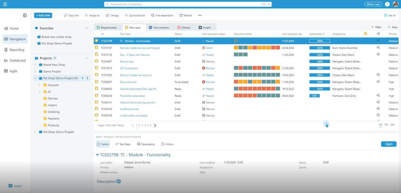
aqua cloud offers you an efficient way to access instant test run results. Within the navigation view, you can quickly see the latest run results and the history of the last ten runs, color-coded for easy reference. This feature works for both test cases and test scenarios.
How it helps you: Providing immediate visibility into the latest test outcomes, aqua allows you to quickly identify and address issues. This one is crucial for ensuring continuous integration and delivery without delays. Also, the instant feedback loop helps you maintain high software quality and reduce the time to market.
2. Detailed Run Results
For a more in-depth analysis, you can navigate directly to the test case or test scenario and open the ‘Executions’ tab. This section offers comprehensive details about each run, including who executed it, when it was done, and the specific data used. Additionally, you can drill down into each execution to examine individual test steps and their results.
How it helps you: This level of detail empowers you to conduct thorough investigations of test results. With this feature, you can efficiently carry out root cause analysis and enhance your decision-making. It also improves accountability and transparency within the testing process. You will be able to make sure every aspect of the test execution is well-documented and traceable.
3. Dashboards with Execution Results
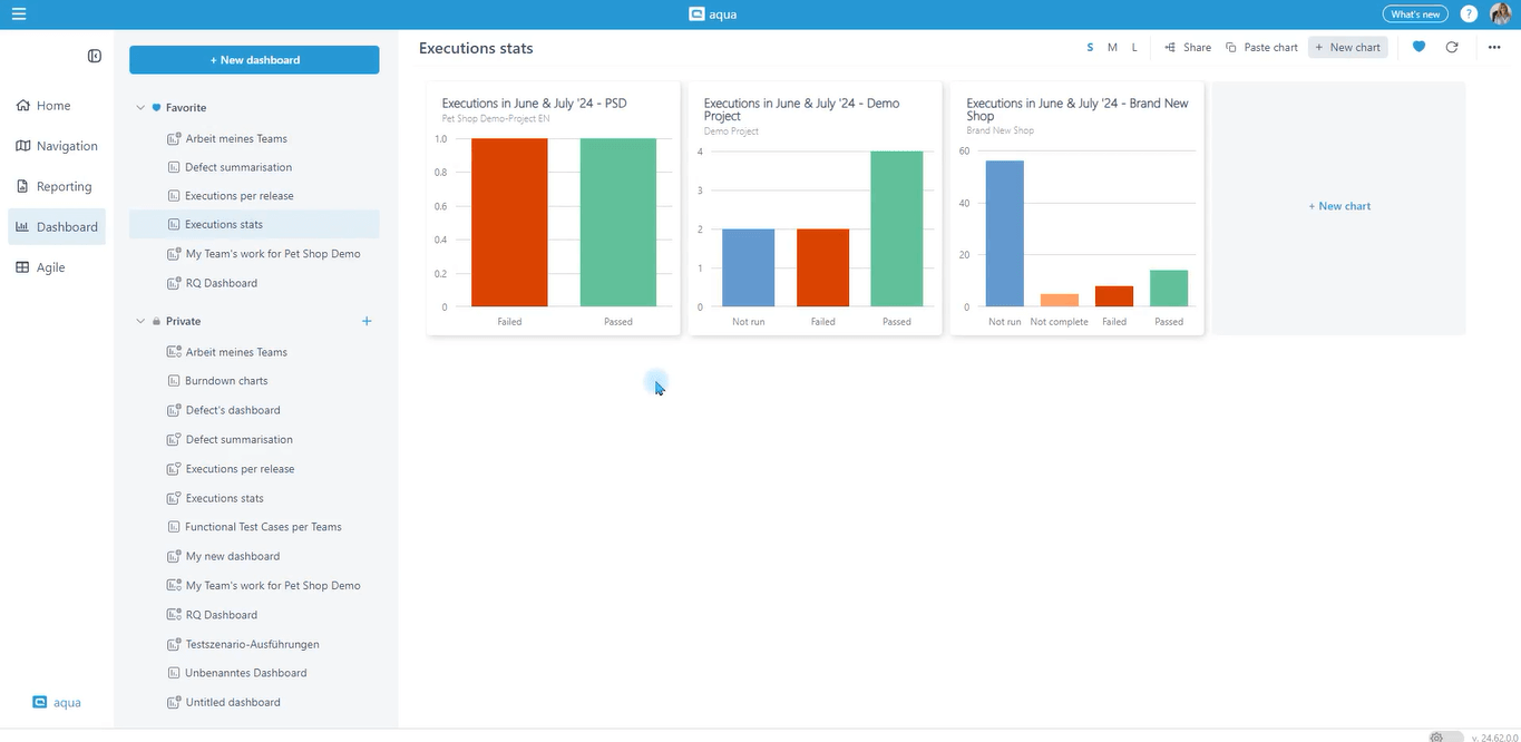
aqua allows you to create custom or use pre-built dashboards for visualising test execution summaries. These dashboards can display data in various formats such as graphs and pie charts, and offer options for grouping, filtering, and setting KPIs and alerts.
How it helps you: Dashboards provide a customisable and intuitive way to monitor testing progress and performance metrics in real time. By visualising key data points, you can identify trends, track progress, and make data-driven decisions. This flexibility means everyone has access to the information they need in a format that suits their preferences.
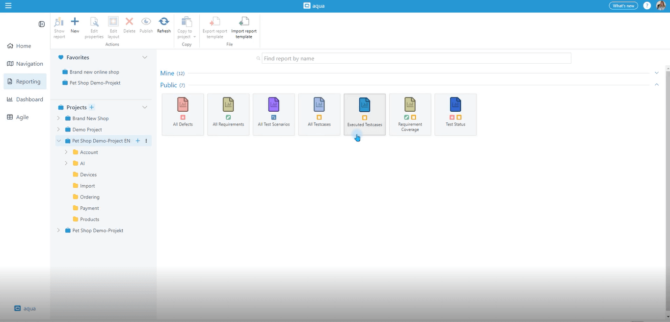
4. Reports for Extended and Combined Views
aqua cloud features a pre-built ‘Execution Report’ which can be customised or created from scratch using a drag-and-drop builder. These reports offer a comprehensive view of all project-related test executions. The cool thing is thar these reports are dynamic: you can specify the data scope and criteria each time you run them. You can also export them in various formats and schedule them for email delivery.
How it helps you: Reports provide a detailed view of the testing, crucial for comprehensive analysis and reporting. This feature is specifically useful for management and stakeholders who require detailed insights into the testing process and outcomes. Scheduled reports also help you ensure that the latest information is always available.
And here is the detailed, step-by-step guide video from our customer success manager, Sylwia Mazepa:
We implemented the following concept:
1. if a defect is found in our test environment the issue type is "Fix Task"
2. if the defect is found on the Production environment we create a bug ticker In regards to the reporting, we created some Jira filters from which we can export the results and make a graph or we just implement a Dashboard with a graph comparing number of Fix tasvs Bug tickets.
All of these look cool, right? But what if we told you that is just a small portion of the power aqua cloud gives you?
With aqua cloud, you can achieve the following:
Accelerate Your Testing Cycle: Achieve faster and more efficient testing by creating requirements, test cases, and test data with AI in just three clicks. AI-Copilot guides you through the entire process.
Achieve Complete Assurance: Ensure every requirement is fully accounted for, tested, and validated with 100% traceability, giving you total confidence in your testing outcomes.
Build Effortless Collaboration: Streamline your bug reporting process and improve collaboration with developers by integrating the visual bug recording tool, Capture.
Maximise Automation Efficiency: Enhance your testing process with seamless automation using frameworks like PowerShell & UnixShell for shell tests, Ranorex for web, mobile, and desktop automation, Jenkins for continuous integration, and many more.
With aqua, you never feel the weight of software testing on your shoulders. Do you think you deserve this relief? We think you do.
Best Practices for Test Result Visualization
Effective test results dashboards require more than added charts. The following practices separate visualisation that supports decisions from visualisation that gets overlooked.
Build separate views for separate audiences. Engineers require failure detail, stack traces, and step-level results. QA leads require coverage and execution progress. Executives require a single release-readiness indicator. A dashboard designed for all three audiences typically serves none of them well. aqua cloud supports role-specific dashboards, so each group opens the view relevant to their responsibilities.
Lead with trends rather than snapshots. A pie chart showing today’s pass rate provides limited value. A line chart showing pass rate across the last ten builds shows whether quality is improving or declining. Set the default dashboard view to a time series wherever the data supports it.
Apply colour consistently across every view. Establish a fixed scheme early: red for failures, green for passes, amber for blocked or skipped results. Inconsistent colour meanings force readers to check the legend repeatedly, which slows the rapid scanning that visualisation is meant to enable.
Limit the primary dashboard to five metrics. Each additional chart competes for attention with the metrics that matter most. Move secondary metrics to a drill-down view rather than crowding the main screen.
Make every chart clickable. A failure count delivers value only when a reader can click through to the failing test cases. Static images return your team to manual searching, which defeats the purpose of the dashboard. aqua cloud links every dashboard element back to the underlying test cases, executions, and defects.
Automate report delivery on a fixed schedule. Manual report assembly before stakeholder meetings consumes hours and produces inconsistent formats. aqua cloud schedules report generation and email delivery, so all recipients review the same data without additional preparation work.
Include context alongside the numbers. A failure spike carries different implications after a major refactor than after a routine bug fix. Annotating dashboards with build notes or release markers turns test result analytics into a record your team can interpret correctly months later.
Conclusion
As we saw together, test run results visualisation is not a formality or aesthetic issue, it is much more. If you give enough care and attention to the process, you get crucial benefits like faster time-to-market or seamless issue detection. For this crucial process, aqua provides everything you need. Knowing you are just a few clicks away from not only better visualisation but also the whole testing process must feel good, right? Just contact us and let us handle your software testing concerns.
Visualising test results helps quickly identify issues, improves communication, and enables more informed decision-making.
What are the most important test automation reporting metrics?
The most important test automation reporting metrics are test pass rates, failure rates, test execution times, and defect density.
What are the best ways to visualize automated test results?
Import automation results into your test management platform rather than reviewing raw CI logs. Combine trend charts for pass rates across builds, heat maps identifying frequently failing modules, and unstable test tracking. aqua cloud integrates with Jenkins, Ranorex, and PowerShell to consolidate these results automatically.
Sylwia's prowess in QA stems from her comprehensive understanding of enterprise ecosystems. As a Lead QA Expert, she has been instrumental in streamlining QA processes for numerous customers and users of aqua, guaranteeing consistent delivery of high-caliber results.
Nurlan, a QA Coordinator & Quality Standards Officer, takes pride in orchestrating seamless QA operations. His expertise in coordinating QA-focused projects and integrating QA solutions has consistently yielded top-tier client satisfaction. Aside from a full-time QA coordinator, Nurlan's role involves creating compelling content that educates…
Home » 'How to' guides » Test Run Results Visualization: Step-by-Step Process
Do you love testing as we do?
Join our community of enthusiastic experts! Get new posts from the aqua blog directly in your inbox. QA trends, community discussion overviews, insightful tips — you’ll love it!
We're committed to your privacy. Aqua uses the information you provide to us to contact you about our relevant content, products, and services. You may unsubscribe from these communications at any time. For more information, check out our Privacy policy.
X
🤖 Exciting new updates to aqua Intelligence are now available! 🎉